I mentioned in a couple of posts at this site that I believe that Cumulative Flow Diagrams (as used in Lean Production) would be a minor improvement to the visual communication and control in FDD - compared to the existing FDD Features Complete graph.
In discussion with Jason Marshall, we concluded that we wanted a graph which would communicate scope creep as well as actual work in-progress and Features completed. We didn't like the current alternative I was using - to display a percentage complete graph based on Feature milestone percentages, and a Features complete graph. The former suffers from the "false reporting" problem and the latter from the lack of inclusion of work in-progress.
This is particularly a problem when CPW sizes are too large, as the development tends not to flow but instead to go-stop, go-stop. Work is always happening but Features are not always being completed.
Jason and I devised a requirement for a graph such as the one shown below. I later discovered that this was a known technique and it had a name already - a Cumulative Flow Diagram.
As you can see it clearly communicates the scope creep in the project, as well as the work remaining, the work in-progress and the total Features completed.
It is possible to produce a version of this chart which shows work at each milestone i.e. you break out in-progress into different categories for each milestone in the DBF-BBF stages, namely "walkthough", "design", "design review", "coding", "code review", "promote to build".
With a graph like this, the manager can see at a glance the health of the project and the possible bottlenecks - cross referenced to the issue log, there is almost no other tool required.
Comments please...
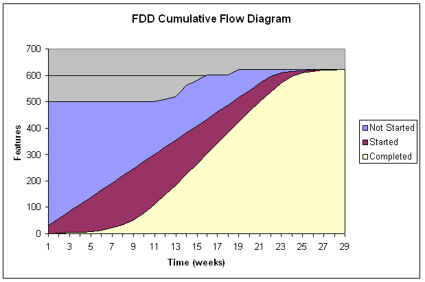
Notes: The start rate for Features in CPWs and the completion rate of Features are highly idealized in this example - its not data from a real project

The virtue of unscaled data
My primary concern was to have a graph on which the scale of the various elements was absolute, rather than proportional to the feature count of the project. Any proportional graphing mechanism essentially claims to interpret information that would better be left to the human observer to interpret, introducing significant artifacts, and potentially harmful misinformation. The CFD is more in keeping with the spirit of transparency that FDD espouses.
If a project only grows a few percent in feature count, one might reasonably argue that the noise (in a proportional graph) is insignificant. However, I believe that there will be many projects that have less controlled growth in their feature counts, due to business or culture constraints. Projects at companies new to or unfriendly to FDD, or where flexibility is along the time axis, or the resources axis, may find their projects balooning in feature count, at which point proportional graphs become meaningless. Even in the case where growth is limited, if the growth occurs in several discrete chunks, good weeks could be turned into bad weeks, and vice versa, confusing the casual reader (and every company will have many of these) as to the true health of the project.
A Nonymous
I suppose I should check to make sure I'm logged in before posting messages. This was not intended to be an anonymous post.
FDD Cumulative Flow Diagram
David,
Perhaps I am missing the obvious but I dont see how this graph shows scope creep. Could you please explain some more.
Also I dont see much value of this graph while the project is in flow. Perhaps you could elaborate on the processes that are initated from this chart.
Thanks
David
Total height and thickness of individual colors
David!
Firstly, it's great to hear from you, mate! It's been a long time.
You read the CFD by firstly looking at the total height. This shows the total scope of the project in Features (because this is for FDD). If you take a vertical slice through the graph i.e. a snapshot at any given time, then the thickness of each color is showing the number of Features at that stage in the process.
With this example, I have chosen to show only 3 stages: not started; in-progress; and complete. It would be possible to show all 5 stages of the FDD process using differing colors (note spelling - yes I've Americanized these last 4 years).
Hence, if you read the chart for week 15: 250 Features are complete; about 130 are in-progress; and about 190 haven't been started and the number is rising.
There are two crucial pieces of detail on this graph:
1. The total height and the trend in the total height - this shows the scope and the creep in scope.
2. The thickness of each color and the trend in the thickness. Except for "completed" it is undesirable to see a trend where the thickness of a bar is growing. This would imply that there is a bottleneck and Features are not flowing through stages of the process. This might be because issues are unresolved preventing work from finishing.
For example, I ran a project where Features could not be shown as finished until they had been deployed on a middleware infrastructure which was being delivered by another team. The middleware was on the critical path for almost every Feature. When 50% of the work had been done, we still only had 4% of the Features completed. Using the CFD chart, this would have shown up as a massive thickness of "started".
If you extend the CFD to show all 5 stages in the process then you get a finer grained view. Watching the trend in the thickness of each color provides early warning (visually) to problems preventing flow.
Hence, on a single graph it is possible to communicate the "Overall Percentage Complete" (the work done including partially complete) and its trend - the "started" line - and the absolute work completed - the "completed" line - which is usually displayed on the Features Completed graph.
Finally, because the graph uses absolute numbers - as Jeff has always advocated - it avoids problems of false reporting seen in proportional graphs. However, as Jason points out, it still provides proportional information i.e. the CFD can communicate the % of work done and the absolute total without introducing false reporting.
To get back to your question about value - the CFD packs more accurate information on a single graph than FDD has previously been communicating.
There are actually considerably more uses for this graph which I will reveal over the coming weeks. I will try to post these to this site but you can also follow them by downloading the chapters of my book from uidesign.net as I post them.
Cheers,
David
--
David J. Anderson
http://www.uidesign.net/
The Webzine for Interaction Designers
Scope Creep
David,
I dont believe you are correct to be defining an increase in feature count as scope creep.
I am interested to see what processes you have initiating based of this report and how these add value to the project.
David
Good Contribution
I think it's terrific to see a contribution like this. Some points of clarification. I don't mean to say at all that the features complete plot or the trend report are the ONLY ways someone should track. Far from it. Once you have a features database (system) there are many reports, graphs and visualisations that are possible. The whole vision I call "Information Mining for Project Managers." It really is a case of whatever works best for you.
Why do I highlight the trend report and the features complete plot? The majority case is that they're the most useful two pieces of information and they also demonstrate what's possible in terms of information mining for project managers on an FDD project.
Personally, and it is personal opinion, I don't want a plot that also shows work in progress. There are a great many pieces of information that can be plotted (any of the Key Performance Indicators on the trend report for example) but at the end of the day, to be Agile is to value working code over all other works in progress. Thus, the features complete plot (plotting that one KPI - key performance indicator) only is what does this.
I see you've described a case which is rather atypical - lots of work in progress, very little complete. That's fine - use a different plot or visualisation then, but that is not a majority case. I could contrive all sorts of corner cases that would call for different reports and graphs. To do so though wouldn't be useful as a general and simple method or process.
Regarding scope creep, I really (personal opinion) don't need or want a graph for that. Genuine scope creep is controlled and well known.
I can easily, easily, track an increase in the number of features from the trend report and also from the weekly summary report (the new features business activity - if present under a subject area).
However, David Bye is right. An increase in the number of features does not necessarily equal scope creep. If you really wanted to track scope creep as distinct from other types of new features, then you could use the same "new features" business activity technique but simply create another business activity called "scope increase" or something like that and put those features in it.
I'd love to see more people sharing the kinds of reporting or graphing they're doing on FDD projects. Thanks for this contribution to this site.
FDD and WIP
Its an old saw that 90% of projects spend 90% of their time 90% complete, but it encapsulates a big problem. WIP is bad!
Current thinking is to minimize WIP to the point where its not worth tracking. FDD and XP both take this approach!
Beware comparisons to manufacturing! Manufacturing companies need to track WIP for reasons that don't apply to software development. E.g. to get visibility on inventory. Inventory control is not a problem we have in software development!
Phil